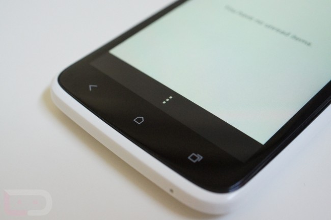
You see that massive, ugly black bar across the bottom of my HTC One X? Yeah, that would be the menu button that Android app developers refuse to move away from even though the Android team announced back in January that the death of the menu button was happening.
What they were hoping to accomplish with this move was a more consistent experience on Ice Cream Sandwich devices because going forward, Android was moving away from dedicated hardware menu buttons. Instead of coding your app to use a dedicated hardware menu button, they recommended that you take advantage of the action overflow capabilities in Android 4.0, which is essentially a menu button that is added to the app rather than one that is tied to a navigation button. If you do not code your app to use action overflow and instead tie it to a navigation button, you get the experience I have captured above if no menu button exists.
Here are a few examples of apps still using the menu button, one being a Google app. And these aren’t all of them either, Foursquare, Hootsuite, ESPN Scorecenter, Sonos, Amazon MP3, Huffington Post, LinkedIn, and so on all continue to use a dedicated menu button with their apps. The list is enormous, and as you can tell, we aren’t talking about some tiny one-man operation here. These are the big boys that are failing to follow Android guidelines.
How should it work and why this move? Well, Google got half way there in their Reader app. As you can see from the screenie below and above left, the top right corner includes a 3-dotted button that is the action overflow area. When pressed, you get additional options that you would normally find when pressing a menu button. It makes sense to use this approach since ICS was built for multiple screens, some of which do not have hardware navigation buttons at all. If you code your app to use action overflow and it is tablet and phone compatible, you get the same experience on both. If you code it to use a menu button, depending on the phone and tablet that a person has, you may have two totally different experiences, which could be confusing to your users.
The reason I bring this up today is because we are seeing more and more phones launch without dedicated hardware menu buttons. The entire HTC One series along with the Incredible 4G LTE and EVO 4G LTE all do not have dedicated menu buttons and will have to experience the evil black bar. It’s time that developers recognize this. Unfortunately, these companies all likely test their apps on a Galaxy Nexus which has the ability to add a menu button to the on-screen navigation area, so they probably think that nothing is wrong.
The end of this issue is no where near completion, but you may want to start asking your favorite app devs to code their apps correctly. As devices continue to launch without dedicated menu buttons, you will soon understand the pain that some of us are experiencing on a daily basis.


Collapse Show Comments171 Comments