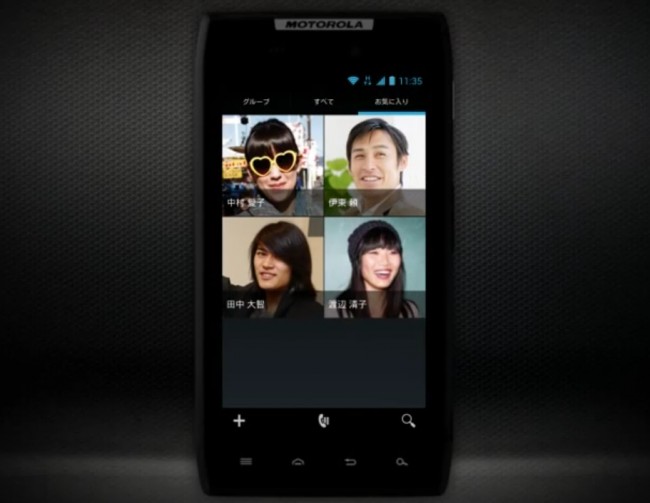
We know that Ice Cream Sandwich for the DROID RAZR will be here some time before the end of June (Q2) thanks to an updated timeline released by Motorola within the last week. What most of us don’t know, unless we flashed one of the leaks, is exactly how Android 4.0 will look and act on the device now that Moto has added their Blur flair to it. In a series of videos released to their Japanese RAZR site, we get to see it all. We are talking Webtop 3.0, screenshots, the new lock screen, time lapse video, navigating around ICS, the browser, dialer, notifications, and more. Just know that some of these are in English while others are definitely in Japanese. You’ll get the idea in all of them though.
One thing even I have to admit is how nice of a job Motorola appears to have done with this. It definitely has their mark on it, but there is a lot of stock Android left in this build. Moto appears to have actually added useful features to this rather than trying to take it as far from the base of Android as they possibly could. Anyone else excited for the RAZR HD now?
Navigating Around Android 4.0:
Webtop 3.0 Basics:
Lock and Home Screen:
Taking and Sharing Screenshots:
Camera:
Face Unlock:
Notification Window:
Buttons and Icons:
Browser:
Dialer and Contacts:
Placing Shortcuts and Widgets:
More Widgets and Shortcuts:
Folders:
Social Networking:
Data Usage:
Via: Motorola
Cheers Guan!


Collapse Show Comments116 Comments