When you’re on top, there’s little reason to innovate. Based on the latest numbers, Samsung gained 26% of operating profits so far this year. Some have gone so far as to say that the only real competition between smartphone manufacturers is between Samsung and Apple.
Yesterday Samsung revealed the Galaxy S III, the latest version of the very popular Galaxy line of phones. While the Galaxy S and Galaxy S II have been major devices for the past two years (hence Google’s continued partnership with Samsung on the Nexus line of phones), the Galaxy S III looks like a me too device that doesn’t stand out on its own. Personally, I wasn’t impressed with the Galaxy S II, but I think the Galaxy S III is a joke compared to the competition.
The Hardware Design
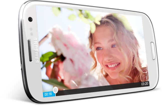
I won’t bore you with admonitions about how important hardware design is. Simply put, hardware design can make a device really stand out next to the thousands of black slabs released every year. Samsung did everything it could to make the Galaxy S III stand out in all the wrong ways.
The first thing that bothered me about the Galaxy S III was the home button. I understand the appeal of a physical button, but it still makes it look like Samsung is trying to copy the feel of an iPhone. I thought the same thing when I saw the Galaxy S II and the Droid Incredible. It may not have been intentional, but having a physical home button is very reminiscent of the iPhone. To make matters worse, Samsung decided to add a silver rim around the phone. Instead of using aluminum to copy Apple’s tired design outright, Samsung elected to use plastic. It looks cheap, like a mophie case.
I think the 4.8 inch screen is way too big. At this point I think Samsung is just trying to troll me. The Galaxy Note is way too big, but Samsung tries to market it as a tablet and a phone, so maybe it’s gray area. This size screen just reminds me of the Dell Streak. Maybe the Galaxy S III will sell well, but if it does I don’t think it will be because people think 4.8 inches is the perfect size; it isn’t. I find myself unintentionally switching to use two hands with the Galaxy Nexus, so I’m sure most people will have to use two hands to use the GS3 comfortably. It’s also very disappointing that the screen is PenTile.
The Software
Lately there has been some backlash against the term skin because manufacturers aren’t just skinning Android devices, they’re adding features and apps to customize the software on the phone. Skins can be a wonderful thing. TouchFlo made Windows Mobile almost usable. Sense made early Android appealing to me. The latest version of Sense is much less overwhelming, especially with the redesigned clock widget (finally!). TouchWiz, on the other hand, has always felt cheesy to me. The latest version hasn’t changed those impressions of cheesiness.
The skin looks mostly identical to the Gingerbread release on the GS2. In other words, it looks cartoony and cheap. I could possibly understand using a skin to change the design of the operating system if the stock look was horrible (like WinMo and early Android), but this is inexcusable. Ice Cream Sandwich looks great; TouchWiz is not a visual improvement by any means. It would have been much better if Samsung had just added some enhancements on top of the ICS design like CM9.
Samsung also added some software enhancements on top of ICS. Some of these enhancements are actually useful like Smart Alert and Direct Call. Smart Alert makes the phone vibrate when it’s picked up if a notification has been missed. It’s a subtle way to notify the user physically. Direct Call is even more useful – if you’re sending someone a message, you can bring the phone up to your face and it will call that person. It’s not life changing, but it is nice.
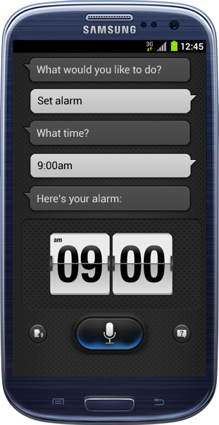
Other features, on the other hand, are absolutely ridiculous. Smart Stay, which tries to track your eye to see if you’re still looking at the screen in order to determine if the screen should be turned off or not, seems like a creepy waste of battery life. S Voice is even more insane. S Voice is clearly Samsung’s attempt to rip off Siri in design, with somewhat improved functionality. From what was seen it doesn’t look like S Voice is nearly as conversational as Siri, but S Voice has access to third party apps and a few actions that Siri can’t do. In the end, it makes Samsung look like they’re trying to copy Apple by slightly improving Google Voice Search.
Conclusions
The internal specs of the Galaxy S III look great, but at this point smartphone competition isn’t about specs as much as it is about the overall experience. The question isn’t whether or not is has a Tegra or Snapdragon processor, but what kind of experience those specs help facilitate. Most top tier phones can handle anything thrown at them, which is great. Android OEMs definitely helped push each other to release incredible internal hardware, but at this stage in the game there are very nuanced differences in terms of performance between top tier phones, which leaves ecosystem, hardware design, and software.
As a whole Android is a strong ecosystem. Most new apps are launching on both iOS and Android, and more iOS-only apps are making their way to Android. That said, making Flipboard a Galaxy SIII exclusive is a shame – it should be released for all phones at the same time. Flipboard is a great app, but that alone doesn’t make the GS3 more appealing, just annoying for another reason.
I usually don’t care for Samsung’s hardware or software design, but the Galaxy S III is just atrocious to me. The claim that the hardware and software are inspired by nature doesn’t make any sense to me. The colors in TouchWiz are over saturated and unnatural. The hardware looks cheap and mismatched with the silver rim. I don’t understand why Samsung waited to release this underwhelming follow up to the Galaxy S II. It would have blended right in with Samsung’s other mediocre announcements at Mobile World Congress.
It’s a real shame that Samsung didn’t really try and innovate with the Galaxy S III. In a lot of ways, it feels like the iPhone 4S – a warmed over version of last year’s phone. It seems as though most manufacturers have plateaued in terms of design and innovative features. I love the design of the One X, but at the end of the day it’s a slightly altered Sensation. Sense 4 looks much better than 3.5, but it’s not a major improvement for Android. TouchWiz is assaulting to my eyes and a step down from the stock ICS launcher and design. The Galaxy S III should have been a device that challenged HTC and Apple, but instead it looks like a “me too” device. The Samsung Galaxy S III is an unexciting refresh of Samsung’s tired hardware design and over saturated skin, nothing more.


Collapse Show Comments286 Comments