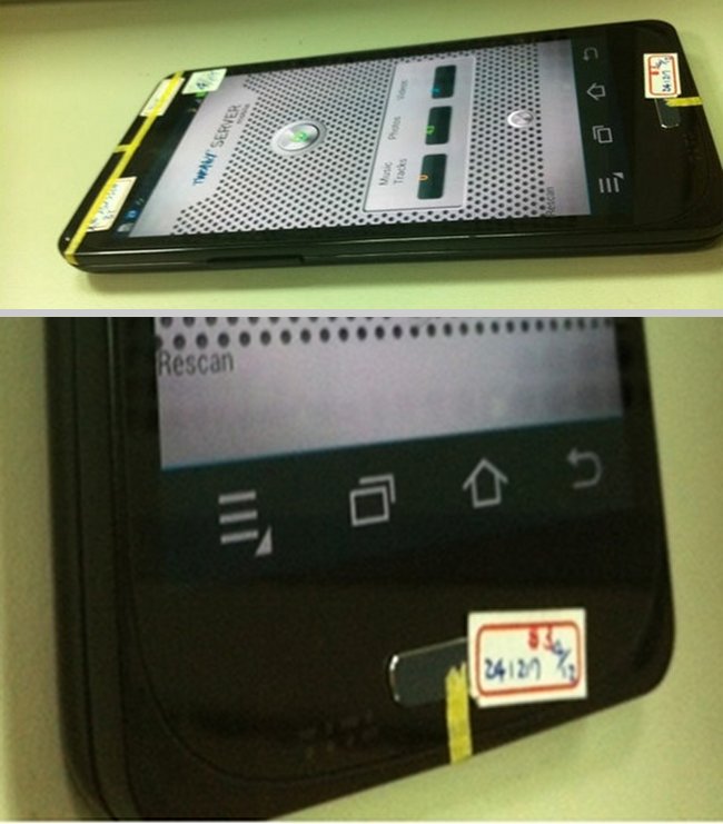

These dummy boxes that they have placed on top of the “next” Galaxy aka the Galaxy SIII are cracking me up. Look at that faux home button that has basically been taped on. Classic. Well played, Samsung.
Enough laughing though, let’s talk about these new photos that appeared today. Is that really a new on-screen menu button? Indeed it is. And yes, the entire navigation arrangement is still out of order from the Galaxy Nexus even with the menu button appearing. Why didn’t Samsung choose to put the menu button on the right hand side of the navigation keys like on the G-Nex? We have no idea, but damn is it annoying.
One thing I will say is that on-screen keys are so desperately needed in Ice Cream Sandwich. After having the HTC One X and its hardware keys for the last few weeks, I’m stuck with an on-screen menu button that displays itself as a massive black bar across the bottom of the screen when an app calls for it, all while eating up precious real estate. At least with the next Galaxy, we won’t have that issue as the menu button will simply appear next to the other nav keys. Or hopefully app devs will listen to the Android team and remove the menu button altogether from their apps and force extra actions into the action overflow menu up top.
What do you guys think?
Via: The Verge
This post was last modified on April 25, 2012 7:23 am
