Since the iPhone, many manufacturers have tried to mimic Apple’s design by releasing black slab after black slab. Some phones in particular, like the HTC Droid Incredible, were more similar to Apple’s design than others. Most manufacturers have made little to no effort to make their phones stand out with hardware (with the exception of strange gimmicks like the Continuum’s second screen), instead opting to differentiate with software. While some manufacturers seem to believe the only way to differentiate and get noticed is through software customizations, other manufacturers like Nokia have tried to pursue differentiation through hardware. I believe that hardware can make much more of a difference in connecting consumers to their devices than software can.
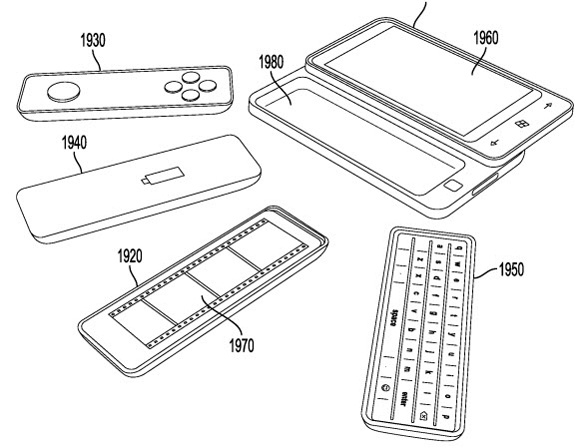
One area that we’ve seen very little improvement in is hardware customization. We’ve seen phones like the HTC Surround with its boombox speakers and the Xperia Play with its gamepad, but those form factors are relatively limited, pushing them into the hands of very specific customers. Of course, the best example of the potential for hardware customization has to be a patent Microsoft filed for a Windows Phone with a slide out tray to hold different hardware components like a keyboard or an extended battery (The patent instantly reminded me of the LG Versa VX9600 which had a detachable keyboard.). The potential for this kind of hardware customization is tremendous; it’s a shame that Microsoft hasn’t done anything with it yet (or that someone else hasn’t used the idea). This sort of hardware customization would really help phones feel far more personal and perhaps extend the life of a device.
One of my pet peeves with many devices that I’ve handled is inconsistency with the materials used in the device. The Droid Incredible, for example, is made of glossy plastic in the front and soft-touch plastic in the back. The Galaxy Nexus is just as inconsistent with its materials and color scheme. That kind of juxtaposition of materials makes handsets feel cheap and rushed. Phones with a solid unibody design like the HTC One S and X (I still can’t stop drooling over how nice the hardware looks on the One series), the iPhone 4 and 4S, and the Lumia 800 and 900 really stand out from the pack. Unibody designs show confidence in the materials used and make phones feel much solider than those made of multiple materials.
Perhaps the most important part of hardware design is the screen. Though I really appreciate a well-designed chassis, the screen is what I spend the majority of my time staring at. We’ve mentioned in the past the problems with some display technologies like pentile that struggle to display colors properly. For that reason alone I’d chose the One X over the One S (even though I really prefer the size of the S to the X), especially after seeing the screen comparison made by The Verge. Screen resolution has also evolved rapidly, with phones like the Galaxy Nexus, the Rezound, and the One series sporting 720p displays when only a year ago phones were being released with 800×480 displays. Text on these displays is clearer, images are more detailed, and more content is visible. Finally, laminating the glass as close as possible to the display itself makes a tremendous difference in how a device feels when you touch it. The smaller the gap between your finger and the display, the more responsive and natural the software feels.
One of the simplest things to implement is color options. If you want into any carrier store you’ll be surrounded by black slabs with the occasional white chassis. While the Lumia 800 and 900 are nothing to write home about as far as software goes, the cyan chassis is absolutely gorgeous and eye-catching. If you don’t believe me, walk into an AT&T store – the Lumia catches your eye right away. The simple addition of color options goes a long way in making a device all the more attractive, but it also adds far more personality and intimacy than a hardware spec or skin ever could. Life is colorful, so why shouldn’t our phones be?
I think manufacturers have truly underestimated the power of a well designed phone. Part of that attitude has been fettered to the release schedule for most manufacturers, but many flagship phones like the Galaxy Nexus don’t feel or look as well designed as others like the One X. Software can be a powerful differentiator, but true software differentiation comes from apps, not Sense or TouchWiz. Specs like a 16MP camera and a 1.5 GHz dual core processor look great on paper, but without complimentary gorgeous hardware they’re just words. How a device feels and looks is much more important to consumers, especially as the specs race has raised all boats for the most part. With hardware customization options like Microsoft has envisioned and brilliant color options, phones could become more personal. I already feel like my phone is much more personal than my computer, but that doesn’t mean that I don’t want it to be beautiful. Hopefully more manufacturers follow HTC and Nokia’s lead by designing truly beautiful handsets.
This post was last modified on January 18, 2020 7:53 am


