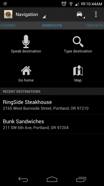

A couple of weeks ago, Google updated Google Maps Navigation screens with bigger buttons and to be more car-friendly. Today, they updated the actual starting Navigation menu with a new layout to help complete the experience. You now have 4 big buttons to choose from when entering the Navigation screen, along with a list of recent destinations. If you swipe to the left, you get a list of locations that you have starred in Google Places for quick access. If you swipe to the right, you get a list of your contacts that have addresses attached. Seems minor, but man does this make sense.
Update: Google also added in “preferred” mode of transit and gave higher resolution maps to phones with better displays.
Cheers Jason and JW!
This post was last modified on July 24, 2020 8:24 am
