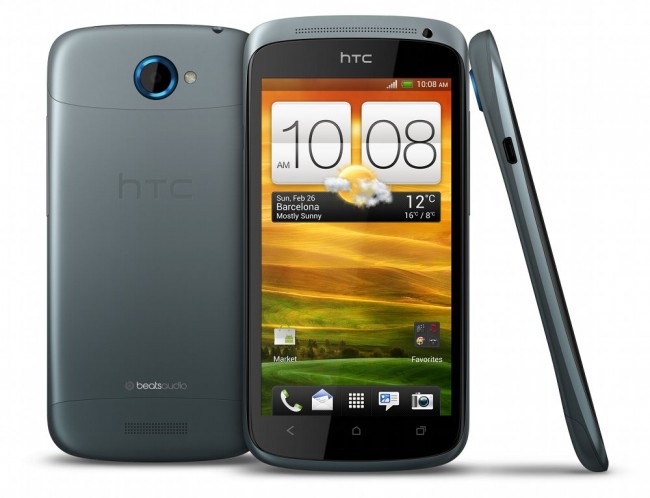
HTC’s chief product officer Kouji Kodera sat down with Pocket-Lint this week to admit that their Sense UI had gotten far too complicated and cluttered in the last couple of releases. From the time Sense originated, HTC had always wanted to keep things simple and easy to understand, but as their skin grew with features, so did the bloat. Going forward with Sense 4.0 and their new One Series, they will attempt to slim things back down:
“There where too many things in there,” Kodera continues. “Even on the home screen we had four or five icons before consumers got a chance to add things themselves. For the HTC One range we have taken it down to Sense 2 again.”
And in case you were wondering, they are attempting to keep Ice Cream Sandwich as untouched as possible. While I find that sort of an overstatement after seeing a couple of Sense 4.0 videos and screenshots, we should at least expect to see less in your face 3D transitions, spinning wheels, and other performance decreasing UI tweaks:
“What we’ve done right now is a good mixture of keeping Sense and Google’s Ice Cream Sandwich element in a good balance. We haven’t tried to change everything here. We have kept a lot of the ICS element but still added the Sense flavour on top of it.”
As someone that was once a fan of Sense, but found it less appealing in the 3.0+ phases, I’m actually pleased to hear this news. HTC needs to go back to their clean and easy-to-understand UI. Looking forward to the One Series or whatever it is they plan to release on Verizon to try to compete with it.
Via: Pocket-Lint


Collapse Show Comments99 Comments