The DROID 4 has had an interesting early life. We handed out the first ever pictures of the device all the way back in October of last year followed by a weekend of D4 info overload that gave you every single detail that you could ever want to know about it. We fully expected this phone to launch in December, but for an unknown reason, it was pushed back and finally released this month. You can grab it now for $199 on 2-year contract in hopes that it can last you the life of a contract. Can it? We are pretty sure that it is up to the task, but let’s talk details for a few minutes. Then you can decide.
The Good:
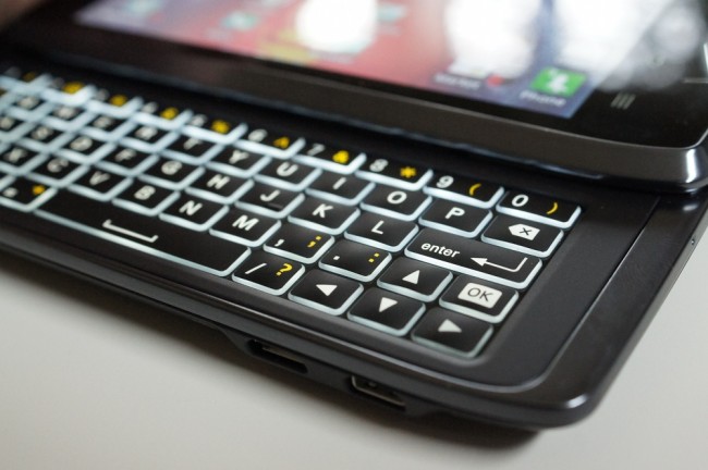
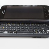
- Keyboard: If you are only interested in phones with physical keyboards, the Motorola DROID 4 should be on your list. Moto has created a beautiful edge-lit 5-row QWERTY that feels great to the touch, is responsive, and also large enough that even big fingered folk should have no trouble tossing out love letters via text. The position of the SHIFT key is still bugging me a bit, but overall, the layout works. Device manufacturers that have plans for future slideout phones (if there are any), take note.
- 4G LTE: Verizon’s LTE network is awesome. We all know that. The DROID 4 latches onto it with ease, holds onto it unlike some other phones thanks to always stellar Moto radios, and makes this phone feel “so 2012.” We still aren’t sure why they didn’t toss LTE into the DROID 3 and can this phone altogether, but that’s how Moto planned it. So far we are all good on the QWERTY and LTE fronts – time to move into hardware.
- Hardware: On the inside, the DROID 4 is exactly like the RAZR and RAZR MAXX. It has 1GB of RAM, a 1.2GHz dual-core OMAP4430 processor, 8MP camera, front shooter for video chatting, and LTE. The only real differences are obviously the keyboard and then the screen (which we will talk about later). For the most part though, this phone is up there with some of the big boys and should have enough power to last you through a contract.
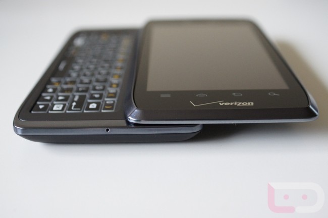
- Size, Feel and Build: As someone that has had a 4.3″ phone in my pocket for years now (seems weird to say “years”), it’s always an adjustment to go back down to something like the D4’s 4″ screen. And then also as someone that hasn’t had a slideout phone since the D2, I’m used to ultra-thin devices that constantly battle for “thinnest in the world” titles. The D4 actually feels pretty good though. It’s not heavy or overly thick for having a keyboard attached, and one could still make the argument that a 4″ screen is optimal. It feels great in hand with the keyboard slid out or closed and held up to your ear during a call. It’s a classic Motorola build job, which is a good thing.
- Camera: Motorola went through a period some time last year where they were putting quite possibly the worst cameras available in smartphones. Either that or someone finally showed them how to build software that works properly. As with the RAZR, the DROID 4 has a better than average 8MP smartphone camera. I left all settings as they came out of the box and took the shots you are seeing below. Not bad, not bad at all. The camera is quick to focus, quick to snap shots, and has enough settings and fliters that you can do some pretty fun things if you are into that sort of photography game.
- Price: Once expected to be $249, Verizon must have realized just before launch that this phone wouldn’t move unless it was under $200. Boy are we glad they did. This phone (along with the LG Spectrum), may indicate that Big Red will start to offer affordable LTE devices in 2012. We still expect to see top tier $299 phones going forward, but under $200 options are always welcomed.
- Battery: While it may not pack the 3300mAh battery of the RAZR MAXX, the 1785mAh battery inside the D4 produced enough life to at least get us through most days. With the current crop of LTE radios, we are never going to see long life on a standard battery, but the DROID 4 was able to outperform many other phones. One thing to keep in mind is that the battery is non-removable, so if you purchase this phone, you won’t be able to toss in an extended. It’s unfortunate, but this looks to be Motorola’s standard going forward.
- MotoCast: We all hate bloatware, but I’m actually a huge fan of Motorola’s MotoCast. This would be their “access your PC from anywhere” software. It works great too. After installing some simple software on your computer and then attaching it to your phone through MotoCast apps, you can play music, watch videos, view pictures, and fondle documents while on the go. The integration is pretty seamless and through a few MotoCast-ready phones now, I have yet to run into any major hiccups.
- Smart Actions: When I first reviewed the RAZR, I wasn’t all that big on Smart Actions. The idea seemed ahead of its time, but for me personally, I rarely found any that were useful. For whatever reason with the DROID 4, Smart Actions were recommending things all over the place and I actually used most of them. As a software that attempts to offer suggestions to make your smartphone experience more intuitive, they do a decent job. Your phone can turn certain things off when your battery is low or instantly pop up your workout playlist when headphones are inserted. This is one of those MotoBlur add-ons that we want to see grow.
- Accessories: The DROID 4 – just like all other Moto phones – has its share of accessories. There are Lapdocks, docking stations, cases, and more. Motorola is one of the few OEMs that produces decent accessories for many of their top tier phones and has them available at launch. (Yes, that was a cheap shot at Samsung.)
The Not-so-Good:
- Screen: And the winner for worst smartphone screen in history goes to…the DROID 4! I trashed this thing in my brief overview of the device and want to continue that here. I still cannot figure out what the hell Motorola was thinking. After putting in a Super AMOLED Advanced screen into the RAZR which came out months ago, why would they choose to drastically downgrade this phone so much? The ghosting between home screens or really anything for that matter, is so noticeable that it is embarrassing. The screen tech is incapable of producing perfectly straight lines, the pixelation can be seen with the naked eye, and the colors are just so unnatural that you at times don’t know what you are looking at. I honestly cannot imagine a more horrific display experience than what Moto has produced with this phone. It’s PenTile Matrix, and boy is it PenTile Matrix.
(Click to enlarge)
- Gingerbread and MotoBlur: I like Gingerbread for the most part. I can even admit that I like pieces of MotoBlur. But after coming from a Galaxy Nexus and Ice Cream Sandwich, these two pieces of software together feel so old. It’s not that the OS or the phone is slow, it’s just that this phone was released this month which just so happens to be 3 months after Ice Cream Sandwich became available. And with Motorola tossing out this ICS update timeline that doesn’t include any sort of specifics for the D4 other than that they are still evaluating it, it may be a while before you get off the 2010 Gingerbread train.
- Bootloader: Yeah, Moto did it again. This phone is locked up tight and will likely never be unlockable. If you are looking for a developer-friendly device, this is not it. Sure, there will be a small community dedicated to it, but the experience will always be shaky and you will have constant fears of potentially soft-bricking your phone without a way of restoring it.
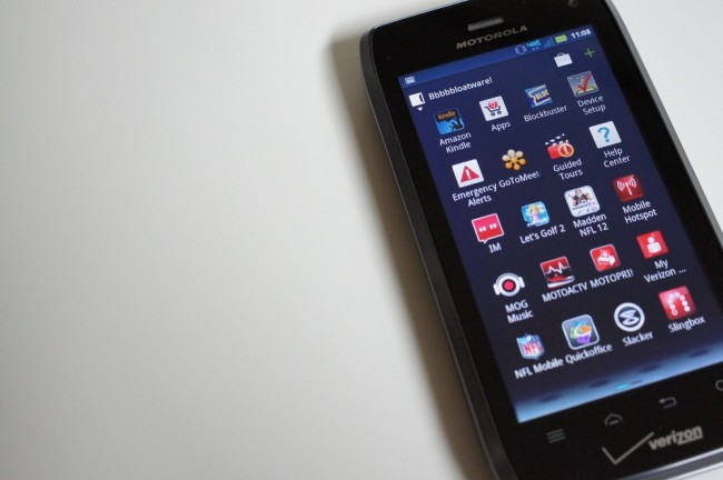
- Bloatware: One of our favorite tasks while doing reviews over the last few years has become the bloatware count. As this Android world grows, so do the number of spam apps that carriers and manufacturers preload on devices. The official count drops it at around 25 apps. Yes, you are reading that correctly. Verizon and Motorola together have managed to load 20+ apps onto your phone that you will likely never use. Some of them are removable, but most are here to stay.
- Non-removable Battery: For some people, this is a killer. The battery life we saw was above average for an LTE phone, but that doesn’t mean that it won’t be acceptable for many. Without the ability to add on an extended battery, some that were waiting for a real LTE slider may end up passing on it.
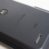
- Design: I’m a big fan of the styling of the DROID RAZR. I am not a big fan of the look of the D4. The keyboard is pure hotness, but the overall design is sort of…well, alienish in an ugly alienish kind of way. The metallic accents aren’t a bad touch, but we would have liked to see straighter lines instead of the wavy corners and oddly shaped profile.
Unboxing and hands-on:
Gallery:
The Verdict:
The DROID 4 is a solid phone. In fact, it’s the best 4G LTE slider ever made (for now). To those that follow Android, that’s not the most difficult title to obtain, knowing that there is only 1 other LTE slider available. But let’s not allow titles to get in the way here. With mostly high-end specs, a great edge-lit keyboard, and a 4G LTE radio, this is the phone for those that can’t live without a keyboard. For those that would go either way on a new smartphone purchase, this phone isn’t at the level of the Rezound, Galaxy Nexus or DROID RAZR. It’s a nice phone, but with one of the worst screens we have seen to date, it’s tough for us to hide the fact that we would go elsewhere. Unless of course you have to have a keyboard.
DROID 4 Specs | Other DROID 4 Coverage

Collapse Show Comments121 Comments