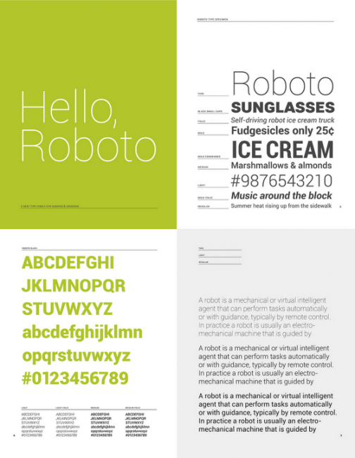
Matias Duarte is the man behind Roboto, the newest font that will be grouped with Ice Cream Sandwich. You would not believe the passion that this guy has for fonts, especially the Roboto that you will see on the Galaxy Nexus. At the announcement of the G-Nex, Matias got on stage and talked about the Roboto font as if it was life changing. After reading more from him about the creation of this font, I’m not so sure that it isn’t. Matias writes why the change from DROID to Roboto was not only for looks, but as technology changed and higher resolution screens are now more dominate, the font needed to change as well.
Why replace Droid?
Droid is a great font family which served Android well over the years, but it was designed and optimized for screens that were much lower in pixel density than today’s HD displays. To be legible at smaller sizes, and to avoid turning to anti-aliased grey mush, the letter forms had to be quite dramatic. They had a tall x-height and a very regular rhythm so that they snapped to the pixel grid crisply. The bold variant was significantly wider than the regular text, because when a letter’s vertical strokes are one pixel thick, the only way to be bold is to double! It’s no surprise that on high rez screens, and at larger more dramatic headline sizes, Droid struggled to achieve both the openness and information density we wanted in Ice Cream Sandwich.
There might be no man seemingly more passionate about making Android look good for everyone. Let’s be thankful he is on our team. He makes Ice Cream Sandwich sound like a albino unicorn grazing in a field with rainbows surrounding it. Magical.
What were we looking for?
Most important was to create something that matched our ambitious design goals for Ice Cream Sandwich. Emotionally we wanted Ice Cream Sandwich to enchant you, to be attractive and eye-catching. Our new typeface had to be modern, crisp, and structured to match our new emphasis on open layouts and rigid grid alignments, but also friendly and approachable to make Android appealing, and a little bit more human.
The Googlers have certainly put their hard efforts into Ice Cream Sandwich. Now all we need is the device. You can read Mr. Duarte’s full post on the Roboto font here. Want Roboto on your phone? Then check our download post here.

Collapse Show Comments33 Comments