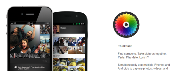
This past Friday was pretty confusing for app reviewers; while scoping out new releases to examine, I came across a large number of media outlets reporting that Color, released March 23, was going to be the newest thing in social sharing. It touted a number of features that both amazed and confused me, particularly its main function: photos taken in a geographic proximity to each other (such as at a concert, office or party) would be grouped automatically together for viewing and commenting.
Users would take a picture of themselves to furnish a profile, which, in turn, would be viewable to anyone who happened to be in range. Naturally, since it was reported on heavily, users scrambled to download Color en masse; after all, how much bragging rights would they be entitled to if they were among the first to use such an amazing and revolutionary app?
Color is an interesting concept, and provoked a number of questions, like “What if people didn’t want every photo available they take at a party made public?” “What happens when someone wants something deleted?” and “Do people actually take party pictures with the frequency the FAQ image would suggest?”
It would have been great to answer some of these questions, had the application not been a buggy piece of garbage.
So that’s how it’s supposed to work…
I’m honestly quite disappointed. On paper, Color should have been an interesting take on the Instagr.am “social photo stream” fad: it had received $41 million dollars in pre-release funding from venture capitalists and had taken the time to secure two large domain names (color.com and colour.com, respectively.) That much effort and potential shouldn’t have yielded a bad product. Any company with so much media hype and investor confidence has to be good, right? Sadly, users didn’t see it that way, slamming the app’s market page with harsh review after harsh review.
But were those users right in doing so? I mean, Color applied the “beta” tag to the title. In theory, that should absolve it from fault when it:
- Failed to work at all on any number of phone models.
- Looped force-close after force-close when the user tries to do any number of basic app functions, such as attach a user image, or take photos, period.
- Forgot to teach the user how to use the app in the first place, due to a lack of any FAQs, tutorials or information whatsoever.
I would list more, but that was all I could get Color to do on my Motorola Milestone, which is barely a year old. Not everyone has access to horribly high-end models, and should be able to expect that something as low-fi as a gallery should work quite well. But these flaws in basic operation are alright; I mean, it’s in beta, right?
I would fully expect Color to try to take advantage of that “beta” status to save face, saying that its obvious lack of quality control or testing was all “part of the plan”. After all, it was the glorious users who alerted them to the problems, so the beta must have done its job. It’s a pity that what was once a term that had a valid point in a development cycle of an app is now being used as a licence to ship something completely nonfunctional.
“Beta” used to imply that a piece of software was close to completion, had all its features in a row and just neeed some last minute tweaking by a small group of users who understood that they were getting an unfinished product. While Color hits some of those points, it utterly fails on others: it is nowhere near “feature complete” if, as a social app, it cannot run on a great number of phones.
It is even worse if the control group of users who are testing expect that it is complete, regardless of the label attached. As we’ve seen, the Android userbase is quick to chew up and spit out anything that fails to deliver. Does this mean we, as users, are going to be wary of the beta tag in the future? Will we be more likely to forgive developers who hide behind its shield?
Will we insist that an app actually be worked on until it’s fit for mass consumption, instead of being pushed out to generate and satisfy hype?
These are questions to think about while you’re mashing that “download” button in the Marketplace.
—
Matt Demers is Droid Life’s app guy, and has missed writing these kind of articles. You can follow him on Twitter and through his site, and e-mail him with tips.
This post was last modified on January 13, 2020 10:46 am
