This is a guest post written by @ronoffringa, a long time Droid Life reader and launcher aficionado.
There are a lot of third-party application launchers available for Android from GO Launcher EX to ADW to LauncherPro. Most Android users choose to go to a third party launcher to either get a stock look on their phone or just to customize it more. While my personal favorite launcher has always been LauncherPro (please no hate mail from ADW fans), the delays in an update to the rewrite of LauncherPro made me begin to look elsewhere for a new feel for my phone.
Launcher 7 is an attempt to replicate the simplicity of Windows Phone 7’s launcher on an Android device, and it does a great job. There are others out there (like Windows Phone Android), but Timo Kujala’s Launcher 7 easily takes the cake. From live tiles to widgets to transition animations, Launcher 7 is the way to go for someone who wants a simple launcher or who loves the look and feel of Windows Phone 7, but doesn’t want to leave the Android fold.
The Set Up
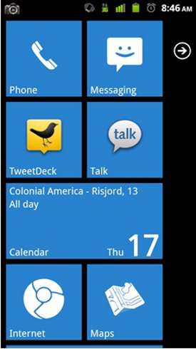
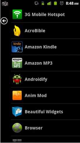
When you first open Launcher 7 it gives you a default set of icons like Phone and Browser and then lists the rest of your applications to the next screen on the right, which can be accessed by swiping over or pressing the arrow. If there is an application that you want to add as a tile to the main screen, all you have to do is long press the application and a new screen will appear allowing you to customize the tile with whatever icon you want and how large you want the tile to be (1×1, 2×1). Launcher 7 comes with a set of white icons to use if you want to try and make each tile look as close as possible to WP7, or you can just use the application’s default icon.
Live Tiles
This is where Launcher 7 really shines over and against other WP7 launcher imitations. There are options for live tiles, like the calendar tile you see above. The calendar tile will cycle through your 24 hour events or display an event that is coming up that day. Another option for live tiles is a People tile, which displays pictures of your various contacts. For those familiar with WP7, you’ll recognize that these live tiles are straight from the WP7 launcher. While the options for these lives tiles are limited right now, there is a lot of potential to make the app even more like WP7 and then to expand beyond with custom live tiles.
Widgets
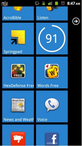
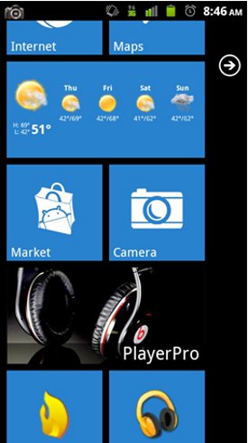
Recently, support for widgets has been added. As you can see from the images above, my battery percentage and weather forecast widgets fit right in with the rest of the tiles. Any widget can be added by pressing menu and then Add Widget. While there will be some limitations for which widgets can be added (mostly size), you shouldn’t have much trouble finding a way to get the information you need onto your main screen. The widgets update automatically and respond exactly how they would if they were on a normal Android launcher.
Wrap Up
Launcher 7 isn’t for everyone, but for people who love a simple experience and want access to their information and their applications quickly, Launcher 7 is worth a try. The dev doesn’t guarantee that the launcher will work on all phones, but a quick perusal of the comments will show that most phones handle the launcher just fine. It has easily replaced LauncherPro for me because of its simplicity. I’m by no means a lover of minimalism (I would pick Fancy or Beautiful Widgets clocks over any other clock), but with a busy schedule and a need to access things quickly and easily, Launcher 7 helps me get things done. Besides all of that functionality mumbo-jumbo, it’s fun to use. I find myself choosing to use Launcher 7 more and more because I enjoy the simple beauty that it offers.
You can find both a free version (with ads on your applications list page) and an ad-free paid version in the market. Even die hard fans of Launcher Pro and ADW should give this a shot – you may be pleasantly surprised.


Collapse Show Comments69 Comments