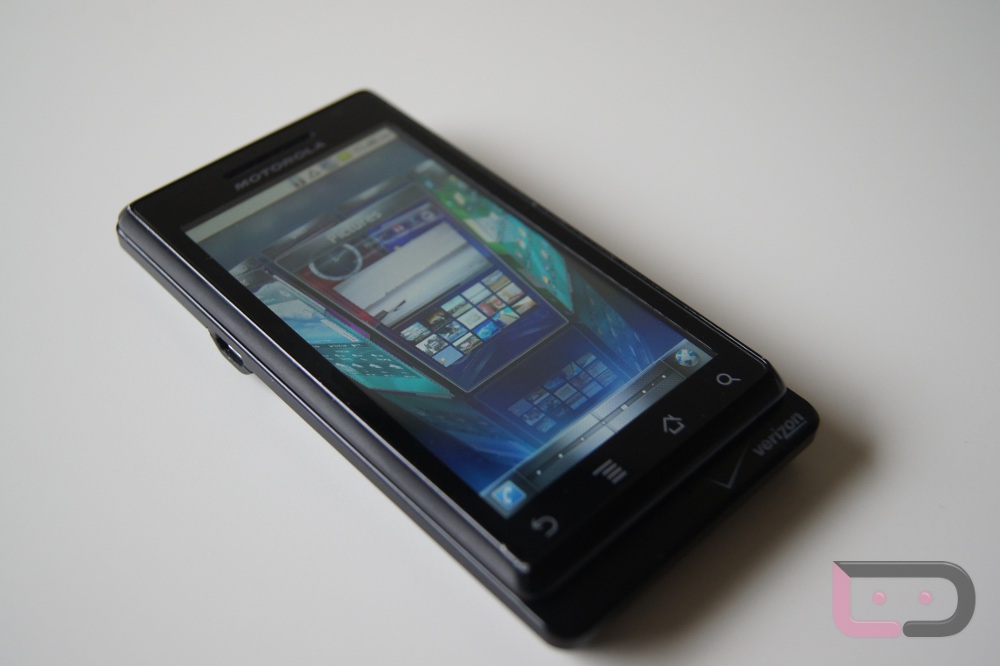
Some of you may remember a little product that was introduced back in December called SPB Mobile Shell 5.0? If not, just think of it as a home replacement on UI-enhanced beautification-steroids whose beta testing period finally went live. And with sneaky apks flying around the forum-sphere, we were able to get a hold of it for just enough time to do a quick walk-through.
So what do we think about it? It’s got potential. You can’t deny the fact that they’ve put a ton of effort into making the UI super smooth, but also very eye appealing. Once you get into “wheel” mode you really get to see the beauty, like how each panel has it’s own custom animation. While it didn’t like any of my Blur’d phones, it ran just fine on my original DROID because of the stock Android and I’m sure it would just fly on phones with a much more powerful processor. They also allow you to quickly create folders, extend out apps to show more options, and even hide certain things in the bottom tray. It’s a unique experience that really can’t be described.
The one problem I did have with it though, was the fact that it removed the application drawer and instead placed all of my apps into their own separate panels. This just reminded me way too much of iOS, so if they can find a way to include an app drawer, they might really be on to something here.
Note: About the beta program…it’s closed and we aren’t allowed to post up the apk.
Video and gallery after the break.


Collapse Show Comments113 Comments