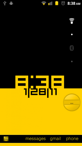
Time and Date Contrast Live Wallpaper just took over my homescreen. The idea for this clock seems so simple, but that might just be why I’m loving it so much. I had actually started working on this post last night, but was treated to an update this morning that gives you the ability customize the top and bottom colors to match your current theme which was request #1 from us. Aside from the colors, the beauty here is really the action between the time and date, which you’ll see when sliding from screen-to-screen giving it an almost 3D feel. Not bad for a free clock option that doesn’t take up any widget space.
Oh, and the developer is just getting started, so we’ll likely see font options, clock/date options, and who knows what else. Might want to get in early on this one.
Cheers Shane!
This post was last modified on January 10, 2020 9:23 am

