My phone plays a large part in retaining my daily sanity. I work at a summer job where there is a lot of downtime, and at the moment I do a lot of switching between my Twitter and Facebook apps to check social streams. While I’ve never been one of those guys to say “Man, I wish I didn’t have to do the arduous process of switching between apps”, I won’t turn down apps that do both jobs well.
I’ll come out and say it: Tweetdeck for Android does that. Amazingly.
Though I had an account, I had never really used Twitter intensely until I installed the Tweetdeck desktop client. The web version’s interface makes is very unwieldly, as you can only see one stream at a time: sometimes friends of mine don’t even notice people are tagging them in posts until way past the fact. Tweetdeck made it easier by sorting different streams into different columns: one for your friends, one for your replies, one for your direct messages and customizable columns for custom searches. Later adding FourSquare and Facebook support, Tweetdeck makes it easy to post and monitor multiple accounts from one suite.
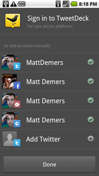
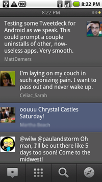
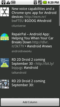
Tweetdeck for Android replicates this well by keeping the column design, which is accessed by swiping from side-to-side, like your home screens. When you start up the app for the first time, it prompts you to add as many accounts as you’d like: currently supported are Twitter (duh), Facebook, Google Buzz and Foursquare. As a result, you can see friends from each network’s posts, which are color-coded for easy viewing. Along the bottom of the home screen are four buttons: from left to right, they allow you to post a new message, manage accounts and view friends (divided by account, or all at once), do a Twitter search and bring up a GPS-enabled map (I’ll come back to this later).
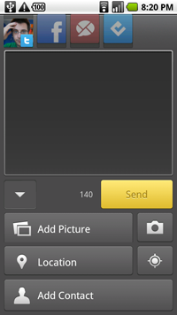
Creating a new post allows you to check off which account you’d like to post the message to. The interface for this is easy to use, as each check-button is color and label-coded, so you don’t confuse accounts. You can attach pictures, location, and search an address book to tag your friends (Twitter only, at the moment) all from one screen. This is everything I expect from a full-featured Twitter client, but being able to post to the other services without having to switch to a widget or app is a great relief.
The account management and friends portion is very robust, allowing for a complete listing of every friend by service and alphabetical order. This is great for messaging specific people, especially when you don’t want to wade through the Twitter web interface’s horribly-sorted mess of icons. You can also write directly to a friend’s Facebook wall from their entry, as well as direct message them on Foursquare.
Also in this part of the app is a listing of your accounts, which allow for a singular view of everything having to do with them; the support for Facebook, Google Buzz and Foursquare is amazing here, even featuring full badge icons and mayorship listings.
Search is very functional, letting you find usernames and hashtags easily. Those hashtag searches can then be added as columns, allowing for real-time tracking. Ultimately, it’s simple, be effective.
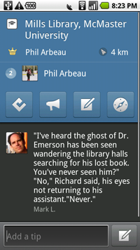
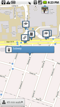
Now, I said earlier I would come back to the map, and I’d like to say this: by itself, it has made me uninstall my Foursquare app. The reason is simple: it allows me to view nearby checkins on a map, instead of refreshing an oft-inaccurate list of nearby locations. I like this visual component of the game, as sometimes my GPS will think I’m miles away from where I know I am, and I will have to go into the text search to find my venue. This is a very large improvement over the Foursquare app, even if it requires listings to have accurate addresses. It also lists where friends have checked in by placing their icon on a map, Google Latitude style. I haven’t been able to see if it works with GPS-enabled Tweets yet, as they do not show up. This would also be a big plus.
The options section is a little lacking, only letting us customize which columns will send a notification to our tray. It would be nice if we had the ability to choose how often they would, but I’m sure that will be included when it comes out of beta. Another desireable feature would be the ability to change the theme, like the desktop client.
But all in all, Tweetdeck has made me go against my rule of loving the first party. They have put together an amazing application that has made me uninstall my Twitter and Foursquare applications from my phone, as really, I don’t need them anymore; Facebook will stay, however, as I need message/photo/event support. Improving systems that already exist by making them easy to use and visually appealing is a sign of great development, and should be what people designing Android apps should strive for.
So go out and sign up for the Tweetdeck open beta; you get an .apk in your confirmation, which you can them use to install your app. Happy tweeting, and feel free to add me @mattdemers.
—
Matt Demers is a Toronto writer who can’t wait for summer to be over. He writes about Android for Droid-Life and about comics, D&D and other nerdery for NerdGirlPinups.com.

Collapse Show Comments38 Comments