When you buy a smartphone, one of the features that’s obviously being considered is its browser. The ability to browse the Internet is integral to the smartphone experience; without it, you lose a lot of the functionality that makes it so damned useful. API Internet calls to fuel our apps are one thing, but the inability to bring up any web page we want, whenever we want would strip smartphones of a lot of their core usability.
So naturally, the browser that one uses on their phone is pretty important. Right now, there are numerous options for the discerning Android users to take into account. The ones that I have spent time with (and have detailed in this post) are all viable choices, but have little quirks that may or may not influence your decision.
I originally set out to do this post at a reader’s suggestion, in order to determine which browser was “best”. However, I came to realize that not every browser suits every user’s needs. I can’t really make a clear decision if the default browser is the one that suits me, can I? Hopefully you’ll find something here that suits your needs, and download accordingly. For your convenience, I’ve created a feature table for quick reference: it’s embedded at the bottom of the post, if you don’t feel like viewing it via link.
To review these browsers, I used a Motorola Milestone that is on Canada’s Telus network. I felt the need to omit speed comparisons, as networks differ from region to region, and under wifi connection, I found they all performed relatively the same.
Testing was accomplished by a general “to do” list, which included:
- creating and managing bookmarks
- creating, switching and deleting tabs
- sharing with the web/apps
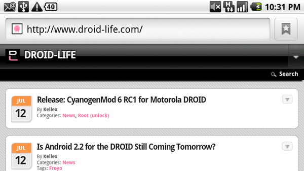
- viewing Droid-Life.com via the browser
- app-specific features, like viewing a plug-in video with Skyfire or testing gesture support
So, without further ado, I present to you the Droid-Life.com Android Browser Super-guide.
The Default
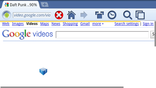
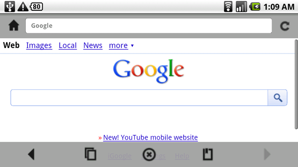
So, here’s the benchmark. The default Android browser has many of the tools most people need in their day-to-day operation on the Internet. It draws from your phone’s global bookmark pool, handles tabs (if not a little clumsily), has the ability to share pages on a variety of different app platforms and generally works quite well. It lacks a lot of the features some browsers have, like themes and add-ons, but really, for the average user, it doesn’t need that. For some people, they’re content to just browse the web, period.
Default-y has the advantage of being first party, and designed by Google: what it does is do all these basic features extremely well. Honestly, the only notch I mark in the “con” column about the default browser is its unwieldy tab interface. It just takes too many clicks to change, delete or make a new tab: while I don’t use it that often, its awkwardness keeps me from trying to use it more.
Download (or keep?) the default browser if you: don’t care about extra features, and like the way Google designs things.
Skyfire
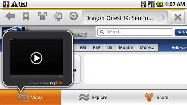
There was much fanfare upon Skyfire’s release, as it was the only browser to offer “fake” Flash; under this browser, one would not require Android 2.2 or Flash 10.1 in order to view enabled objects on web pages. I decided to test this out by going to Gametrailers.com and viewing a video for the upcoming Nintendo DS title, Dragon Quest IX. While a screenshot of the video itself couldn’t be taken, I assure you it did work; after the browser identified a Flash (or Silverlight!)-enabled video, it could load and play it. Sadly, this does not include Flash-enabled games, but really, it’s better than nothing.
Otherwise, the feature list is quite unremarkable: it does tabs and bookmarks and all the other things we’d expect from browsers. These functions are enabled through push buttons at the top of the bar, and perform quite nicely. They’d better: I’d take core functionality over Flash wizardry any day.
Download Skyfire if: you watch a lot of plug-in-based video, and have a generous data plan.
xScope
xScope was the only browser I reviewed that had the option of a paid version. Naturally, being the cheapskate I am, I optioned to take the lite version for a try; I feel that if you’re going to charge for a browser while all your competition’s are free, that free version must be able to stand shoulder-to-shoulder. What struck me about xScope (Lite) was the precense of its UI. Unlike its bretheren who are all too happy to get out of your way, xScope seems to like sticking around. While this makes the tab navigation extremely easy, it runs into the problem of trying to squish in too many features at once.
Yes, I will admit that having to navigate a series of menus to organize tabs can be a bit annoying, it keeps me from having to wonder how I would actually close them; with title bar text and a nice little percentage-based loading indicator (instead of a bar), there isn’t much room for a touch-sensitive “X” to close it. This can be achieved by a long-press, but it’s not exactly apparent. What would make it better would be a (hideable) “Are you sure?” pop-up. That way, people wouldn’t be closing things by accident.
Inexplicably, besides a download manager it also has a task killer and file browser built right in: I didn’t like this, as I have apps that do these things much better installed on my phone already. While I’m usually a fan of consolidation, I don’t like when a company feels the need to shoehorn in other features needlessly.
[update]: I’ve been since notified that it only requires a single press of the tab to close it while you’re viewing it. I don’t mean to doubt the devs, but I can’t get this to work at all. It seems to require a long press for me.
[update2]: I neglected to mention a big selling point of xScope: its one-finger zooming. By double-tapping on any point on the screen then dragging your finger left or right, you can zoom in or out accordingly. This is a great feature (when I can get the feature to trigger, which is rarely) and is actually worthy of some praise: it adds a little bit of functionality to portrait browsing.
However, I have a problem with the way it’s implemented: the tutorial to use this and other features is a small link at the bottom of the settings page; unformatted and lonely, I would have passed over a feature that does not make itself apparent otherwise. The least the developers could do would be to give it own graphical button.
Download xScope if: you don’t have ASTRO file viewer or a task killer on your system, and do a lot of one-handed browsing.
Steel
Checking out Steel, I found myself questioning my phone’s graphical capabilities; it seemed like there was fine coat of Vaseline covering my screen. There’s a certain something about Steel’s UI that just doesn’t feel right: there’s a lack of sharp edges, almost like it doesn’t want you to hurt yourself.
Of the browsers I tried, Steel was the most like Android’s default in that it is very bare bones. You’ll get bookmarks (though curiously, not global bookmarks) and a download manager, along with a better tabbing system than the default; it just seems to run smoother, and you’ll find that it takes less clicks to get you where you want to go. On a whole, however, Steel gives me the impression that there’s a lack of ambition on the part of the developers. It’s almost like they got their browser to a working state, said “good enough”, then left it. Not the best browser to download if you’re looking for frills.
Download Steel if: you don’t care about graphics and are looking for something different from the default Android browser.
Dolphin Browser HD
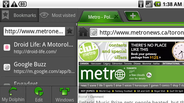
When Dolphin first came on the scene, its big selling point was the inclusion of a Youtube downloader; with it, people could rip videos to their phone for later viewing, saving their bandwidth and time. However, Google put the kibosh on this, but a powerful browser remained. Seen as one of the “big boys” of third-party browsers, Dolphin brings some unique features to the table with add-ons, themes and a kick ass “most visited” panel (as seen above). The tab interface is slick, except for an all-too-small “X” button to close tabs. I find my fingers have a hard time hitting it, and will either change tabs or create a new one by accident.
It also seems to have a problem of scrolling midway down the viewable page when switching tabs: because the tab itself (and its closing “X”) is located at the top of the page (and isn’t a wrapper), one has to scroll all the way to the top every time this happens. It’s frustrating, but you can get used to it.
Dolphin also has gesture support enabled, but I’ve never been a big fan of it; I find that it’s not very forgiving when it comes to wrong swipes, which results in some mild frustration. Some default gestures require a pooling of ink, so to speak, as well: this leads to frustration when I didn’t roll my finger just quite enough to smudge enough area. They’re programmable, but honestly, I have a keyboard on my phone; if I’m going to sit at a phone browser for an extended amount of time, I’ll use that, instead.
Dolphin’s add-on support can also let you do things like tweet from inside your browser, but really, I have better apps for that outside of my phone.
Download Dolphin Browser HD if: you want a browser with all the fixings.
Opera Mini 5
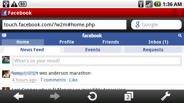
I’m not a big fan of Opera’s offering into mobile browsing; it’s too much eye candy and not enough functionality. It brings a lot of the features of Opera (like the Speed Dial) to the mobile platform, but it all seems very… messy. Look at the Facebook page above: some things don’t line up with each other. The issue’s the same on other high-traffic web pages, like Youtube, which puts me off entirely. A browser can have all the extra bells and whistles in the world, but if it doesn’t do the basics right, it doesn’t deserve my phone’s memory. This is kind of disappointing, considering Opera is a big name in desktop browsing; you’d figure they’d have more resources devoted to a proper Android offering.
Maybe I’m being a little hard on it: it is in beta. However, Opera will need to put a lot more work into the client before I’ll consider giving it another chance.
Opera handles tabs and downloads, but remains unable to import from my phone’s global bookmarks: like with Steel, this is quite an annoyance, especially if I’m looking for easy data migration. It supports RSS feeds in its bookmarks manager, though, which is a plus.
Download Opera Mini 5 if: you want to try a polished product, and don’t have an RSS client.
Mozilla Fennec
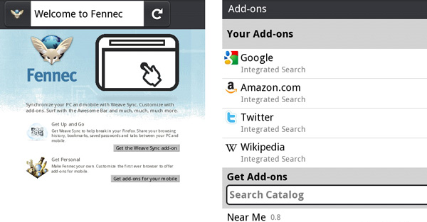
While initially I felt like Fennec deserved a spot in this mega-guide (and the feature table), after installation and quick prodding, I went back on this. Fennec is a pre-alpha product, which means it’s very unpolished. While nightly builds are being updated to the product’s page, it seems like Fennec needs a lot more work before it becomes fully functional. Therefore, it doesn’t really deserve any bashing hammers of criticism I’d like to lay down on it.
But from what I can see, the future looks bright: add-ons, themes, downloads, tabs and RSS will all be a part of this browser. However, curious users will have to put up with choppiness all around as well as a 30MB file size (!) on their phone/SD card if they’d like to get their feet wet.
Download Fennec if: you’re looking to mess around and have another browser installed, just in case.
Wrap-Up and Features Table
So, there you have it, one super-guide for all your Android browsing needs. As promised, here’s a spreadsheet documenting the major features of the browsers I mentioned for quick reference. Hope you enjoyed this guide: if you have any other suggestions for super-guides in the future, feel free to comment on this page, send us a tip, or e-mail me at matt [at] mattdemers.com
(Click to enlarge.)
Matt Demers is a Canadian Android enthusiast who wishes Telus would unlock his Milestone’s bootloader, already. You can find his writing on Droid Life and his personal website, MattDemers.com. You can also listen to him on the Not So Horrible podcast on iTunes, where he and two other geeks discuss tech, pop culture and the world we live in. You can follow him on Twitter, as well: @MattDemers





Collapse Show Comments77 Comments