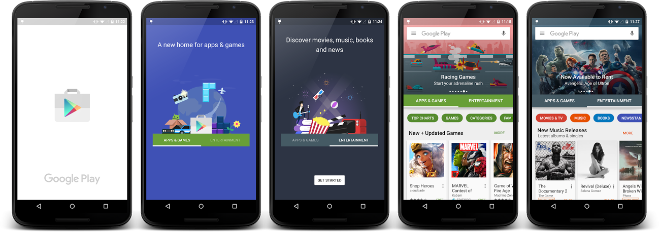
Ready for the next redesign of Google Play? It’s coming #soon, according to Google’s Kirill Grouchnikov, a man of #pixelpushing and Google Playness. Grouchnikov posted screenshots of the update to his G+ this morning, screenshots that show quite a change to Play’s main store page.
In the shots below, we are seeing what appears to be a new intro splash followed by an introduction to the new layout, which will be broken out into “Apps & Games” and “Entertainment” sections. So when on the main Play store page, you will see two tabs – one for Apps & Games and another for Entertainment. Presumably, you will be able to swipe between the two, but a tap on each will also get you there. Gone are the six shortcuts for Apps, Games, Movies & TV, Music, Books, and Newsstand.
From within each, you will now see subcategories like Top Charts, Games, Categories, Family, etc. in the Apps & Games screen. On the Entertainment page, you will then see the familiar shortcuts for Movies & TV, Music, Books, Newsstand, etc.
And then below each of the subcategories, you will get the familiar related shortcuts to apps or content, along with recommendations. Google also appears to be using the new header space at the top of Google Play to showcase apps, games, movies, or whatever else is on their mind.
Kirill didn’t say, but my guess is this is Google Play 6.0.
Anyone see an update to Google Play lately? If you do, be sure to hit us up.
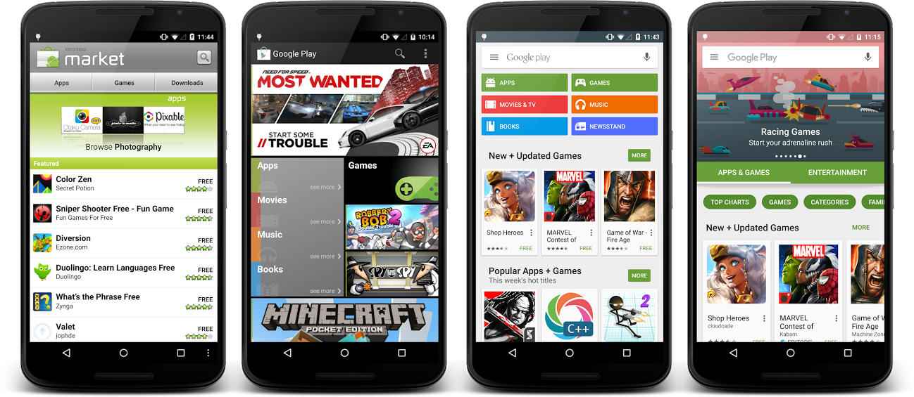
Update: Kirill has since posted even more pictures to drool over, like this of the Play store’s evolution.
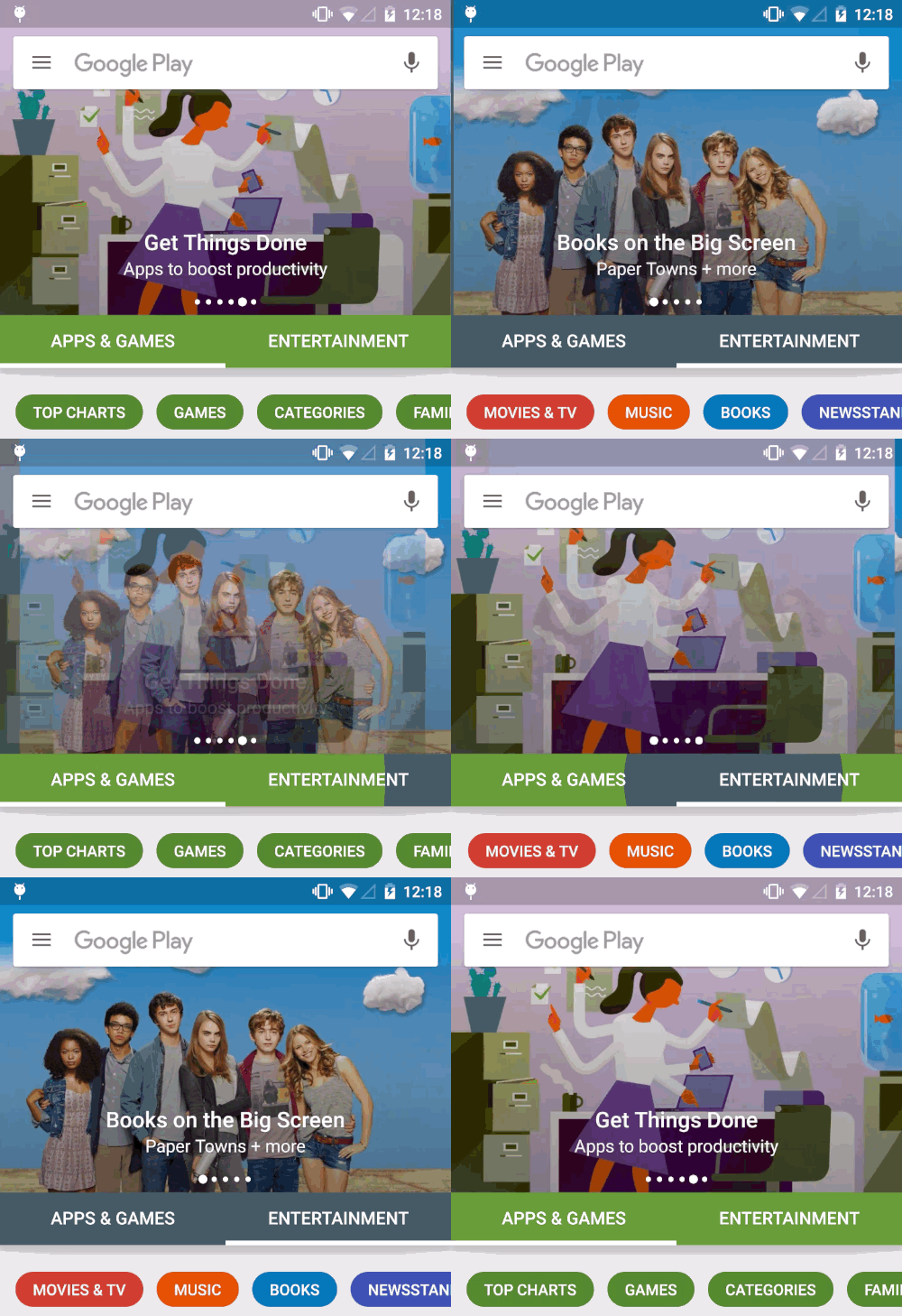
And this one of the transition between Apps & Games and Entertainment. Mmhmmm, pixels.
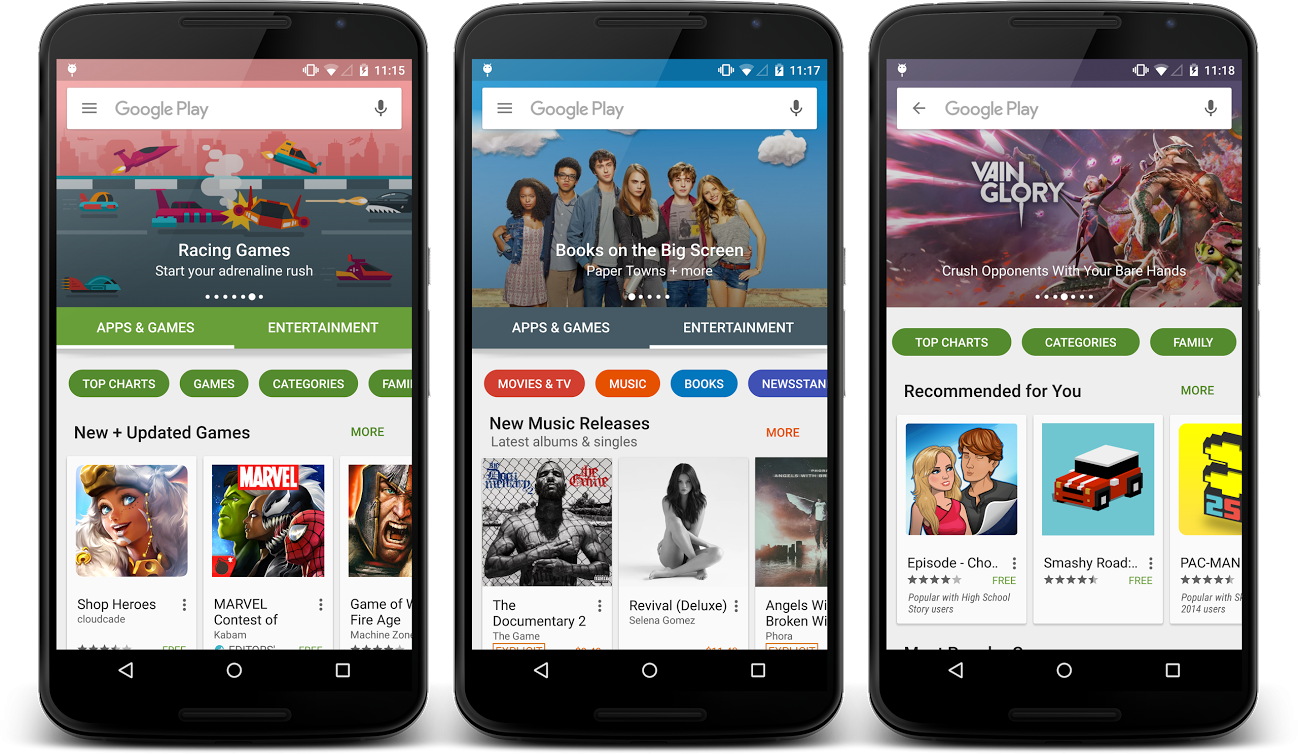
Update 2: Annnnnnd one more.


Collapse Show Comments111 Comments