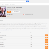
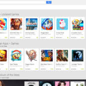
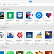
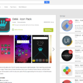
A few weeks back, reports were circling that Google would soon push an updated UI to its desktop version of Google Play. It appears the update is now rolling out to a few users, but we wanted to check in and see if anyone else has been seeing the updated look?
While the changes are not over the top, it reminds me quite a lot of the old YouTube look. Instead of related apps being placed all the way at the bottom of the webpage, they have been moved to the right of the screen, allowing for quicker exploration throughout the store’s offerings.
Other than the updated look for listing pages, all navigation appears to be untouched. And while it does not scream Material Design, it feels rather smooth and responsive.
So, do you have this UI yet on your desktop version of Google Play?
Screenshots


Collapse Show Comments29 Comments