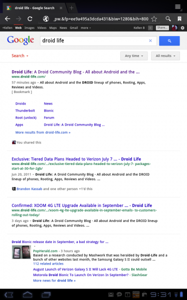
The Google mobile team is at it again – this time with a simplified search experience for tablets. To quote them, they have “increased the size of page contents like text, buttons and other touch targets to make it faster and easier to browse and interact with” which makes complete sense after looking at a quick result for droid life. And also, as you can see in the screenshot above, the overall look has become much less cluttered making content much easier to absorb.
The updated search page will roll out to Andoid 3.1+ and iPad devices in the “coming days,” but could be there for you already.
Via: Google Mobile

Collapse Show Comments19 Comments